本章學習目標
前一章談到流行病學研究設計。本章處理一個更貼近追蹤研究的問題:如果每位研究對象的追蹤時間不同,該怎麼比較事件發生?
例如某研究追蹤病人再住院。有些人完整追蹤 2 年,有些人搬家失訪,有些人 3 個月後就發生事件。這時單純用「事件人數 / 總人數」會浪費資訊,甚至造成偏差。Person-time data 會把每個人實際貢獻的追蹤時間加總,計算 incidence rate。
讀完本章後,你應該能夠:
解釋 person-time 與 incidence rate 的意義。
使用 Poisson distribution 建立事件數模型的直覺。
計算 incidence rate 與 Poisson 信賴區間。
比較兩組 incidence rate 並解讀 rate ratio。
計算 standardized mortality ratio (SMR)。
理解 censoring、Kaplan-Meier curve 與 log-rank test 的基本概念。
辨認 person-time 分析常見錯誤。
為什麼需要 person-time?
假設兩個診所各追蹤 100 位病人。診所 A 平均追蹤 6 個月,診所 B 平均追蹤 2 年。若兩者都發生 10 件事件,能說事件風險一樣嗎?不能。診所 B 給事件發生的時間窗口比較長。
Person-time 是每位研究對象貢獻的追蹤時間總和。例如 100 人各追蹤 2 年,總 person-time 是 200 person-years。Incidence rate 則是:
\[
\text{Incidence rate} = \frac{\text{number of events}}{\text{total person-time}}
\]
常見單位包括每 1,000 person-years 或每 100,000 person-years。單位要寫清楚,不然讀者會像在看沒有標示劑量的處方。
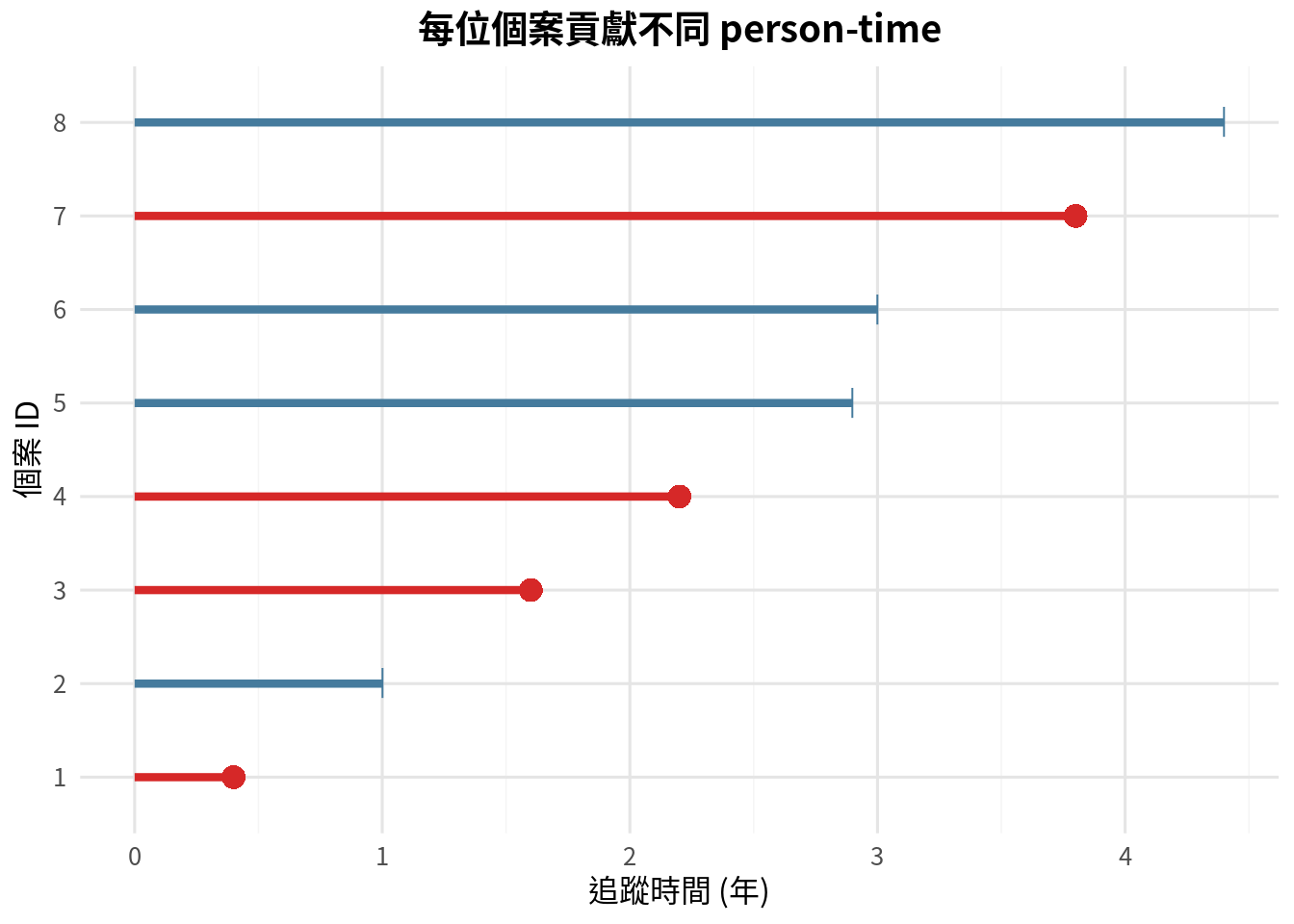
每位個案貢獻不同追蹤時間
<- data.frame (id = 1 : 8 ,follow_up = c (0.4 , 1.0 , 1.6 , 2.2 , 2.9 , 3.0 , 3.8 , 4.4 ),event = c (1 , 0 , 1 , 1 , 0 , 0 , 1 , 0 ),stringsAsFactors = FALSE
  id follow_up event
1  1       0.4     1
2  2       1.0     0
3  3       1.6     1
4  4       2.2     1
5  5       2.9     0
6  6       3.0     0
7  7       3.8     1
8  8       4.4     0
<- ggplot (person_time_df, aes (y = factor (id), x = follow_up)) + geom_segment (aes (x = 0 , xend = follow_up, y = factor (id), yend = factor (id), color = factor (event)), linewidth = 1.5 ) + geom_point (aes (shape = factor (event), color = factor (event)), size = 4 ) + scale_color_manual (values = c ("1" = "#d62828" , "0" = "#457b9d" ), guide = "none" ) + scale_shape_manual (values = c ("1" = 16 , "0" = 124 ), guide = "none" ) + labs (title = "每位個案貢獻不同 person-time" ,x = "追蹤時間 (年)" ,y = "個案 ID"
<- sum (person_time_df$ event)<- sum (person_time_df$ follow_up)<- events / person_years * 1000 <- data.frame (quantity = c ("事件數" , "總 person-years" , "每 1,000 person-years 事件率" ),value = c (events, person_years, rate_per_1000),stringsAsFactors = FALSE $ value <- round (pt_output_df$ value, 2 )
                      quantity  value
1                       事件數   4.00
2              總 person-years  19.30
3 每 1,000 person-years 事件率 207.25
設限 (censoring) 指研究對象在追蹤期間未發生事件,但後續狀態未知或追蹤結束。例如研究結束、失訪、搬家、退出研究。設限不是失敗,它只是告訴我們:「到這個時間點為止,尚未觀察到事件。」
Poisson model 的基本直覺
Person-time 事件數常用 Poisson distribution 建模,特別是事件相對少、每個小時間段發生事件的機率低時。Poisson 模型的平均事件數可寫成:
\[
E(Y) = \lambda T
\]
其中 \(Y\) 是事件數,\(\lambda\) 是事件率,\(T\) 是 person-time。若已知 person-time,事件數越多,估計事件率越高。
範例 1:兩種照護模式的事件率
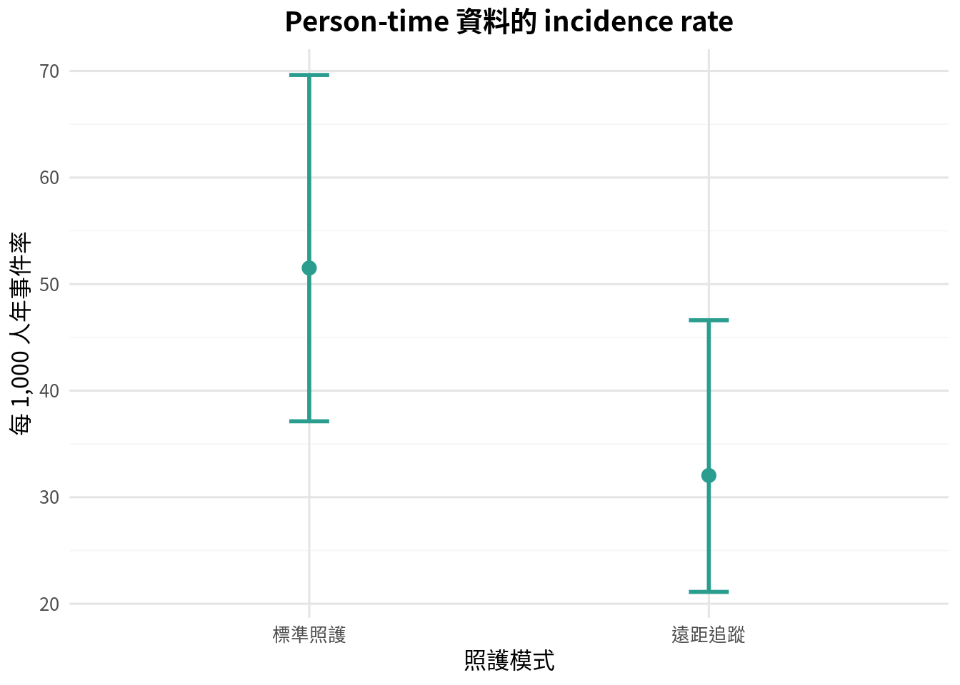
假設比較標準照護與遠距追蹤的急診回診事件。標準照護組有 42 件事件、815.4 person-years;遠距追蹤組有 27 件事件、842.8 person-years。
<- data.frame (group = c ("標準照護" , "遠距追蹤" ),events = c (42 , 27 ),person_years = c (815.4 , 842.8 ),stringsAsFactors = FALSE $ rate_per_1000 <- rate_df$ events / rate_df$ person_years * 1000
     group events person_years rate_per_1000
1 標準照護     42        815.4      51.50846
2 遠距追蹤     27        842.8      32.03607
<- function (events, person_time, multiplier= 1000 ) {<- 0.5 * qchisq (0.025 , 2 * events) / person_time<- 0.5 * qchisq (0.975 , 2 * (events + 1 )) / person_timereturn (c (rate = events / person_time * multiplier, lower = lower * multiplier, upper = upper * multiplier))
<- list ()for (i in 1 : nrow (rate_df)) {<- poisson_rate_ci (rate_df$ events[i], rate_df$ person_years[i])<- data.frame (rate = ci_vals["rate" ],lower = ci_vals["lower" ],upper = ci_vals["upper" ]<- do.call (rbind, rate_ci_list)<- cbind (rate_df, rate_ci_df)%>% mutate (across (c (rate_per_1000, rate, lower, upper), ~ round (., 2 )))
         group events person_years rate_per_1000  rate lower upper
rate  標準照護     42        815.4         51.51 51.51 37.12 69.62
rate1 遠距追蹤     27        842.8         32.04 32.04 21.11 46.61
<- ggplot (rate_df, aes (x = group, y = rate)) + geom_errorbar (aes (ymin = lower, ymax = upper), width = 0.1 , color = "#2a9d8f" , linewidth = 1 ) + geom_point (color = "#2a9d8f" , size = 3 ) + labs (title = "Person-time 資料的 incidence rate" ,x = "照護模式" ,y = "每 1,000 人年事件率"
Rate ratio 與假設檢定
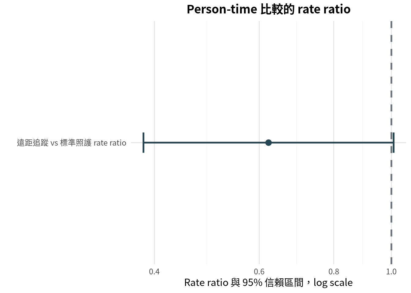
兩組 incidence rate 的比值稱為 rate ratio。若 rate ratio = 1,表示兩組事件率相同。若小於 1,代表分子組事件率較低。
<- function (events_a, pt_a, events_b, pt_b) {<- (events_a / pt_a) / (events_b / pt_b)<- sqrt (1 / events_a + 1 / events_b)<- exp (log (rr) + c (- 1.96 , 1.96 ) * se_log)<- log (rr) / se_log<- 2 * (1 - pnorm (abs (z_stat)))return (list (rr = rr, ci = ci, z_stat = z_stat, p_value = p_value))
<- rate_ratio_ci (27 , 842.8 , 42 , 815.4 )<- data.frame (quantity = c ("Rate ratio" , "95% CI 下限" , "95% CI 上限" , "z 統計量" , "雙尾 p 值" ),value = c (res_rr$ rr, res_rr$ ci[1 ], res_rr$ ci[2 ], res_rr$ z_stat, res_rr$ p_value),stringsAsFactors = FALSE $ value <- round (rr_output_df$ value, 4 )
     quantity   value
1  Rate ratio  0.6220
2 95% CI 下限  0.3835
3 95% CI 上限  1.0086
4    z 統計量 -1.9252
5   雙尾 p 值  0.0542
<- data.frame (measure = factor (c ("遠距追蹤 vs 標準照護 rate ratio" ), levels = c ("遠距追蹤 vs 標準照護 rate ratio" )),estimate = c (res_rr$ rr),lower = c (res_rr$ ci[1 ]),upper = c (res_rr$ ci[2 ]),stringsAsFactors = FALSE <- ggplot (effect_df, aes (x = estimate, y = measure)) + geom_errorbar (aes (xmin = lower, xmax = upper), width = 0.1 , color = "#264653" , linewidth = 1 ) + geom_point (color = "#264653" , size = 3 ) + geom_vline (xintercept = 1 , color = "#6c757d" , linetype = "dashed" , linewidth = 1 ) + scale_x_log10 (breaks = c (0.4 , 0.6 , 0.8 , 1 , 1.2 ), labels = c ("0.4" , "0.6" , "0.8" , "1.0" , "1.2" )) + labs (title = "Person-time 比較的 rate ratio" ,x = "Rate ratio 與 95% 信賴區間,log scale" ,y = ""
Rate ratio 的信賴區間若跨過 1,表示資料與兩組事件率相同仍相容。若沒有跨過 1,代表有較明確的事件率差異證據。不過仍要看絕對事件率差異,因為 rate ratio 只告訴我們相對大小。
Standardized mortality ratio
Standardized mortality ratio (SMR) 用於比較觀察死亡數與根據外部標準率所得到的期望死亡數:
\[
\text{SMR} = \frac{\text{observed deaths}}{\text{expected deaths}}
\]
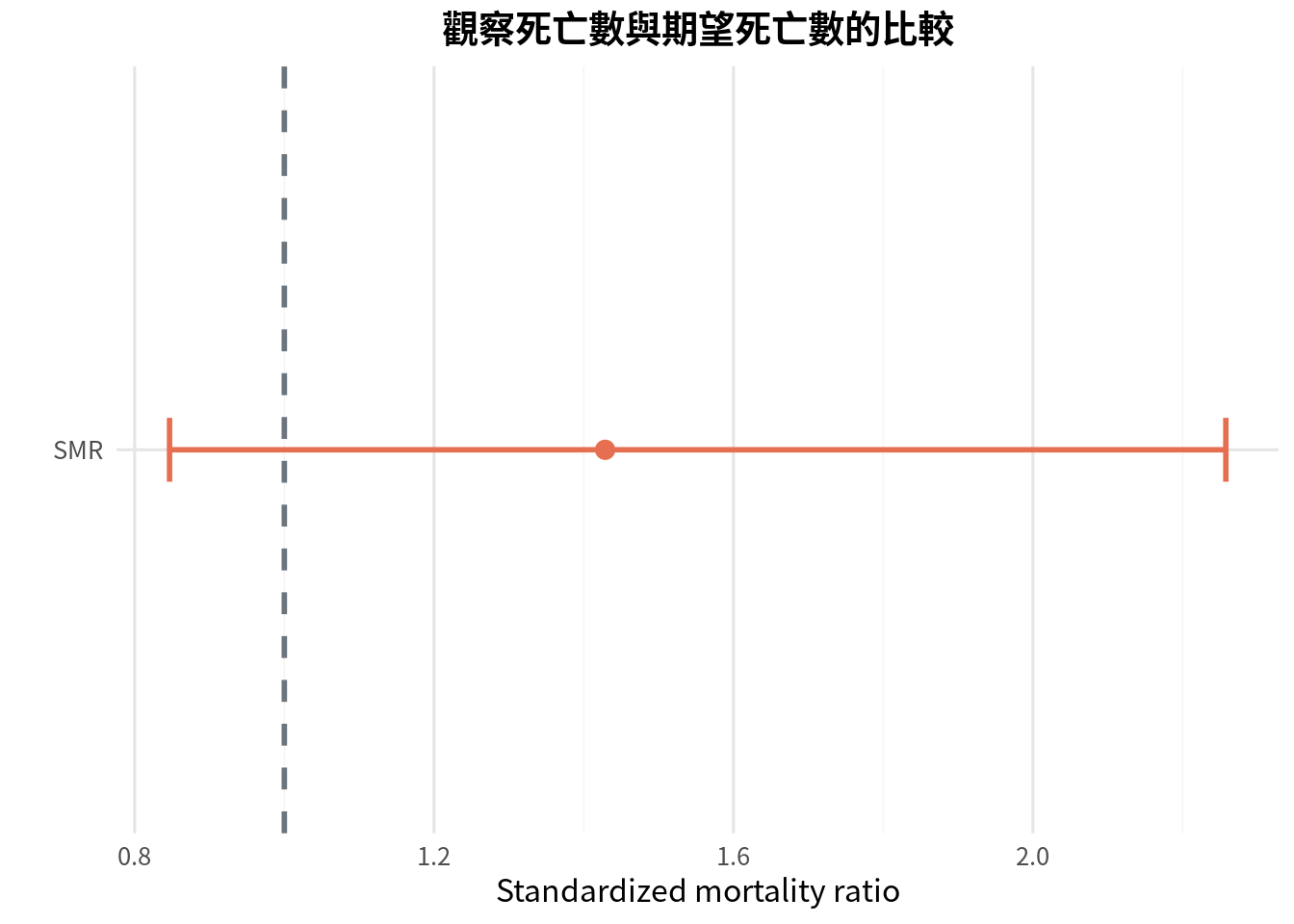
若 SMR = 1,表示觀察死亡數與期望死亡數相同;若 SMR > 1,表示觀察死亡數高於期望。
<- function (observed, expected) {<- observed / expected<- 0.5 * qchisq (0.025 , 2 * observed) / expected<- 0.5 * qchisq (0.975 , 2 * (observed + 1 )) / expectedreturn (list (smr = smr, lower = lower, upper = upper))
<- 18 <- 12.6 <- smr_ci (observed, expected)<- ppois (observed - 1 , lambda = expected, lower.tail = FALSE )<- data.frame (quantity = c ("觀察死亡數" , "期望死亡數" , "SMR" , "95% CI 下限" , "95% CI 上限" , "Poisson 單尾 p 值" ),value = c (observed, expected, res_smr$ smr, res_smr$ lower, res_smr$ upper, poisson_p),stringsAsFactors = FALSE $ value <- round (smr_output_df$ value, 4 )
           quantity   value
1        觀察死亡數 18.0000
2        期望死亡數 12.6000
3               SMR  1.4286
4       95% CI 下限  0.8467
5       95% CI 上限  2.2578
6 Poisson 單尾 p 值  0.0889
<- data.frame (quantity = c ("SMR" ),estimate = c (res_smr$ smr),lower = c (res_smr$ lower),upper = c (res_smr$ upper),stringsAsFactors = FALSE <- ggplot (smr_plot, aes (x = estimate, y = quantity)) + geom_errorbar (aes (xmin = lower, xmax = upper), width = 0.1 , color = "#e76f51" , linewidth = 1 ) + geom_point (color = "#e76f51" , size = 3 ) + geom_vline (xintercept = 1 , color = "#6c757d" , linetype = "dashed" , linewidth = 1 ) + labs (title = "觀察死亡數與期望死亡數的比較" ,x = "Standardized mortality ratio" ,y = ""
SMR 常見於職業流行病學或醫院品質監測。解讀時要記得:期望死亡數來自外部標準率,因此標準族群是否合適很重要。
Time-to-event data 與 Kaplan-Meier curve
Person-time rate 把事件數與追蹤時間加總成一個率。若我們更想看事件隨時間累積的過程,就會進入 time-to-event analysis,也稱 survival analysis。
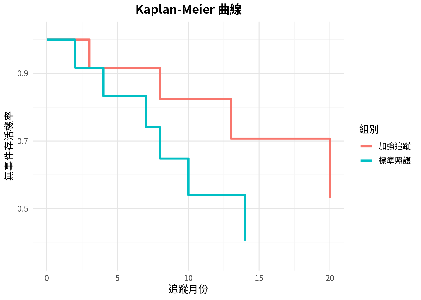
Kaplan-Meier curve 用來估計某時間點仍未發生事件的機率。它可以處理右設限資料,並在每個事件時間點更新存活機率。
<- function (times, events) {<- order (times)<- times[order_idx]<- events[order_idx]<- sort (unique (times[events == 1 ]))<- list ()<- 1 <- 1.0 for (t_val in unique_event_times) {<- sum (times >= t_val)<- sum (times == t_val & events == 1 )<- survival * (1 - observed_events / at_risk)<- data.frame (time = t_val,at_risk = at_risk,events = observed_events,survival = survival,stringsAsFactors = FALSE <- idx + 1 return (do.call (rbind, rows))
<- c (2 , 4 , 5 , 7 , 8 , 9 , 10 , 12 , 14 , 16 , 18 , 20 )<- c (1 , 1 , 0 , 1 , 1 , 0 , 1 , 0 , 1 , 0 , 0 , 0 )<- c (3 , 6 , 8 , 9 , 11 , 13 , 15 , 18 , 20 , 22 , 24 , 24 )<- c (1 , 0 , 1 , 0 , 0 , 1 , 0 , 0 , 1 , 0 , 0 , 0 )<- kaplan_meier_table (standard_time, standard_event)$ group <- "標準照護" <- kaplan_meier_table (enhanced_time, enhanced_event)$ group <- "加強追蹤" <- rbind (km_standard, km_enhanced)
   time at_risk events  survival    group
1     2      12      1 0.9166667 標準照護
2     4      11      1 0.8333333 標準照護
3     7       9      1 0.7407407 標準照護
4     8       8      1 0.6481481 標準照護
5    10       6      1 0.5401235 標準照護
6    14       4      1 0.4050926 標準照護
7     3      12      1 0.9166667 加強追蹤
8     8      10      1 0.8250000 加強追蹤
9    13       7      1 0.7071429 加強追蹤
10   20       4      1 0.5303571 加強追蹤
<- list ()<- 1 for (g in unique (km_df$ group)) {<- km_df %>% filter (group == g)<- data.frame (time = c (0 , part$ time),survival = c (1.0 , part$ survival),group = g,stringsAsFactors = FALSE <- idx + 1 <- do.call (rbind, km_step_list)<- ggplot (km_step_df, aes (x = time, y = survival, color = group)) + geom_step (direction = "hv" , linewidth = 1.2 ) + labs (title = "Kaplan-Meier 曲線" ,x = "追蹤月份" ,y = "無事件存活機率" ,color = "組別" + scale_y_continuous (limits = c (0.35 , 1.02 ))
Log-rank test
Log-rank test 用於比較兩組 Kaplan-Meier 曲線。它在每個事件時間點比較觀察事件數與期望事件數,最後加總成一個卡方統計量。
<- function (time_a, event_a, time_b, event_b) {<- sort (unique (c (time_a[event_a == 1 ], time_b[event_b == 1 ])))<- 0.0 <- 0.0 <- 0.0 for (event_time in unique_event_times) {<- sum (time_a >= event_time)<- sum (time_b >= event_time)<- sum (time_a == event_time & event_a == 1 )<- sum (time_b == event_time & event_b == 1 )<- risk_a + risk_b<- event_a_at_time + event_b_at_timeif (risk_total <= 1 ) {next <- event_total * risk_a / risk_total<- risk_a * risk_b * event_total * (risk_total - event_total) / (risk_total^ 2 * (risk_total - 1 ))<- observed_a_total + event_a_at_time<- expected_a_total + expected_a<- variance_total + variance<- (observed_a_total - expected_a_total) ^ 2 / variance_total<- 1 - pchisq (chi_square, df = 1 )return (list (chi_square = chi_square, p_value = p_value, observed_a = observed_a_total, expected_a = expected_a_total))
<- logrank_two_group (<- data.frame (quantity = c ("log-rank chi-square" , "p 值" , "標準照護觀察事件數" , "標準照護期望事件數" ),value = c (res_logrank$ chi_square, res_logrank$ p_value, res_logrank$ observed_a, res_logrank$ expected_a),stringsAsFactors = FALSE $ value <- round (logrank_output_df$ value, 4 )
             quantity  value
1 log-rank chi-square 1.3343
2                p 值 0.2480
3  標準照護觀察事件數 6.0000
4  標準照護期望事件數 4.2330
Log-rank test 檢定的是兩組整體事件時間分布是否不同。若研究目標是估計暴露對 hazard 的影響,或需要調整共變項,下一步通常會使用 Cox proportional hazards model。那已經是進階存活分析的入口,這本導論先把門打開一點點,不把你推進去。
常見錯誤
第一個錯誤是追蹤時間不同卻只看事件比例。若每組 person-time 不同,事件比例可能誤導。
第二個錯誤是把 incidence rate 解讀成 risk。Rate 可以大於 1,因為它是每單位時間事件數;risk 是機率,介於 0 到 1。
第三個錯誤是忽略設限機制。Kaplan-Meier 與 log-rank 通常假設設限是非資訊性設限,也就是設限原因不應與未來事件風險強烈相關。
第四個錯誤是只報 rate ratio,不報各組事件率與 person-time。沒有分母時間,讀者很難判斷資料量與臨床意義。
第五個錯誤是遇到重複事件仍當成單次事件分析。若同一病人可多次急診或多次感染,需要考慮 recurrent event 方法或合適的 Poisson/negative binomial 模型。
本章重點整理
Person-time data 適合處理追蹤時間不一致的事件資料。Incidence rate 是事件數除以總 person-time,Poisson distribution 提供事件數檢定與信賴區間的基礎。兩組事件率可用 rate ratio 比較,SMR 可用來比較觀察事件數與外部標準下的期望事件數。
當研究問題關心事件發生時間,而不只是總事件率時,Kaplan-Meier curve 可呈現無事件存活機率,log-rank test 可比較兩組曲線。到這裡,全書從資料描述、機率、估計、檢定、迴歸、流行病學設計一路走到追蹤時間資料,統計地圖終於多了一條時間軸。
小練習
某研究觀察到 36 件感染事件,總追蹤時間為 720 person-years。請計算每 1,000 person-years 的感染率。
A 組有 20 件事件、500 person-years;B 組有 35 件事件、620 person-years。請計算 rate ratio。
為什麼 person-time rate 不是 risk?
某醫院觀察死亡數為 25,依標準人口期望死亡數為 20。請計算 SMR 並解釋。
請說明 censoring 在 Kaplan-Meier 分析中的角色。
Log-rank test 顯著時,是否能直接說某組 hazard ratio 等於多少?為什麼?
Glossary
人時
person-time
每位研究對象貢獻追蹤時間的總和。
人年
person-years
以年為單位的 person-time。
發生率
incidence rate
事件數除以總 person-time。
率比
rate ratio
兩組 incidence rate 的比值。
Poisson 分布
Poisson distribution
常用於描述固定時間或空間中事件數的離散分布。
標準化死亡比
standardized mortality ratio, SMR
觀察死亡數除以期望死亡數。
設限
censoring
追蹤期間未觀察到事件,但後續狀態未知或研究結束的情形。
存活時間資料
time-to-event data
同時包含事件是否發生與事件或設限時間的資料。
Kaplan-Meier 曲線
Kaplan-Meier curve
估計無事件存活機率隨時間變化的曲線。
Log-rank 檢定
log-rank test
比較兩組或多組存活曲線的檢定。
危險率
hazard
某時間點尚未發生事件者在下一瞬間發生事件的瞬時率。
重複事件
recurrent event
同一個體可能發生多次的事件。